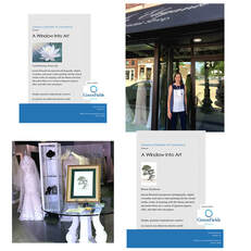
 When one door closes, another opens... As things start to open up in Illinois, so do the opportunities for showing art in unexpected places. The Geneva Arts Fair was cancelled for this year, but is scheduled to return in July 2021. In the meantime, throughout the month of July, you will see art displayed in the windows and inside of stores up and down Third Street in Geneva. All pieces displayed are for sale through the individual artists. I was selected to partner with Kathy Lager (shown here, no that is not me) owner of Veiled in Elegance, at 21 S Third Street. The Water Lily seemed a good fit for this intimate Boutique Bridal Salon, both in subject matter and its pastel color palette. The Bonsai is new for 2020, a new take on an old favorite, and appropriately titled "Resilience." If you are interested in learning more about either of these framed pieces or my processes, please contact me at [email protected]
1 Comment
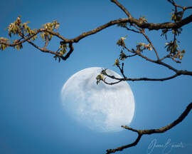
 Red Poppies for Memorial Day Red Poppies for Memorial Day My Sister-in-Law asked for more details on the making of the Red Poppies image that I posted on Facebook and Instagram on Memorial Day 2020. My first instinct was to just send her an email with the details, and not share that on Facebook. Not because there was any "secret sauce" or anything proprietary about it, and not because I was worried that someone might copy it. But rather, because it starts out with a very boring iPhone image and I feared that exposing the ugly underbelly would take away the magic. But then I realized that is the very reason for showing what goes on in my head and behind the scenes. So here goes, and thanks Carole Walthers for asking. 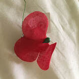 American Legion Auxilary Poppy American Legion Auxilary Poppy Normally American Legion Auxiliary members distribute millions of poppies annually across the country in exchange for donations that go directly to assist disabled and hospitalized veterans in their local communities. Memorial Day weekend and Veteran's day are the main days for this major fundraising event. But due to Covid-19, that could not happen this year. So I wanted to create a visual representation to remind everyone of the significance on Memorial Day. Facebook and Instagram seemed a good place to do that. My typical artistic style starts out with bits and pieces from photographs, and through the magic of digital wizardry, an image is morphed into a painterly "masterpiece." But what could I use as my starting image? My garden poppies didn't come back this year, so that was out. I do not use stock images in my work, so that was not an option either. I turned to the normal cloth poppy that is handed out. As you can see in the attached image: Ugh. The composition wasn't doing anything for me, and it wasn't looking hopeful. 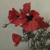 Faux Red Poppies Faux Red Poppies Second attempt. It just so happens that I have a faux bouquet of poppies on my bedroom dresser. I had used them for a sketch-and-watercolor exercise a few weeks ago, so I figured it could work for this. With iPhone in hand, I zeroed in on this part of the bouquet, making sure to include a smaller/younger bloom, and that little bud to emphasize the idea of hope for the future. Now the composition was looking better. But it needed some magic. 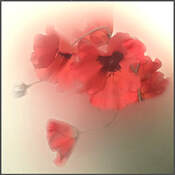 Red Poppies WIP Red Poppies WIP Uploading the iPhone image to my computer, and with a little Photoshop work, I came up with this. I blurred out the ugly background, making the flower soft and dreamy, and giving some nice muted colors as an accent. But what to do about that ugly blown-out bright spot in the upper right hand corner? No problem - just add another layer with salmon-color. 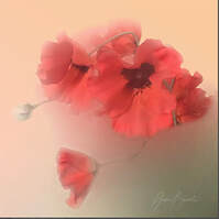 Red Poppies Final Image Red Poppies Final Image Here is the final image. For most of my postings on Social Media, I add my signature logo, so that when people share, others can find me and my work. So share away. Carole asked if I planned to include this on the Art Show circuit this summer. While I do not plan on that (assuming there will be any Art Fairs this summer), if you are interested in having a printed out version of this, DM me for details. 50% of any sales will go to the American Legion Auxiliary to support our wounded and hospitalized veterans. 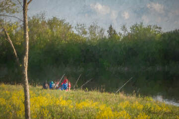 Timberlake Forest Preserve at Sunset Timberlake Forest Preserve at Sunset From last night's sunset visit to Timberlake Forest Preserve; my first visit to this area, which is located just south of Kline Creek Farm. I was looking for egrets and/or herons, of which there were none. Instead, there were lots of people out and about - riding their bikes, walking, taking photos, walking their dogs, and fishing. I counted three little fishing boats, and about a half-dozen groups of people with chairs and fishing poles along the banks of the fairly large pond. There was nothing to hint at the fact that we are still under quarantine orders due to the Covid-19 Pandemic. But was there? I normally do not include people in my photos, but there was something about this little family that caught my attention. I was intrigued: What was their story? Why were they there? Was it a simple family outing to enjoy the weather, or was there more purpose to their endeavor? Perhaps they were one of the newly-unemployed and were short of food. I did not interrupt, and will never know why any of those people were out there. But I do know this: it was a very bucolic scene and it begged to be shared. I left feeling refreshed, peaceful, and happy. I added a few post-production touches to give it that impressionistic look and feel. Cradling the Moon... Did anyone notice the moon last night? I usually go for the full moon, but I am beginning to be a fan of any phase. I captured this one early evening, about an hour before sunset where there was golden light hitting on the tree tops. This is a composite image - one exposure to get the detail on the moon, the other for the detail in the branches. I positioned myself to get the moon placement in between the branches. For the technical-minded, these two shots were hand-held using my Panasonic DMC-FZ70, with attached lens zoomed out about as far as I could go. I love the dreaminess of it - what do you think?
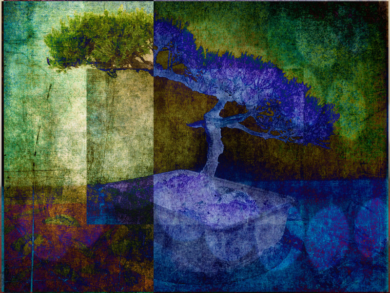
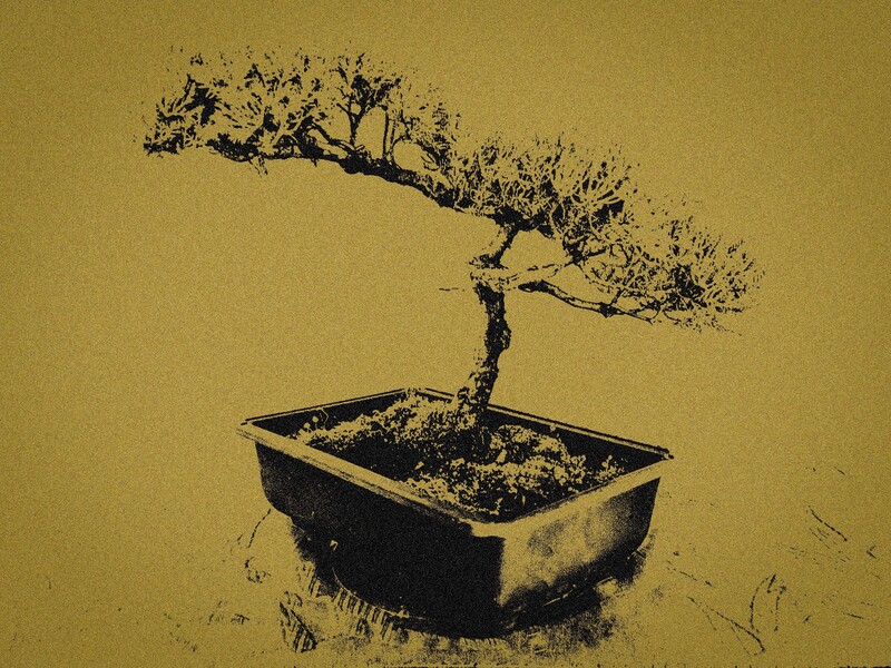
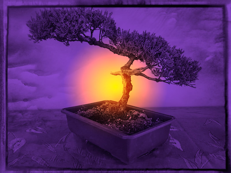
The fotoMuses Potpourri exhibit comes down at the end of this week, but this will not be the end of them. I have decided to include three of them (shown above) in the upcoming Bloomingdale Artists Exhibit in April and May. More about that later. From left to right, they are Geometric Overlays, Mezzotint, and Purple Sunset. By the way, all images in the series of twelve are available for sale. If you are interested in either framed or unframed versions, send an email to [email protected] with your selection(s) and framing options, and I will send you the details. 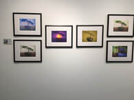 I did say that I would explain my decision for selecting the six, so here it goes. The grouping at the left is a snapshot of their display in the Potpourri exhibit. The criteria boiled down to 1) personal favorites, 2) compatibility with other images, 3) variety of colors and styles, and 4) favorable reaction from you, the viewers on my blog posts, and Facebook and Instagram entries. Oh yes, one more very important criteria: how well will they print? The first to be chosen was a personal favorite: textured overlays with multiple geometric forms that brought out a variety of blues and greens, and a little dash of bokeh to finish it off. The second one was the mezzotint effect, which I included just because it was so different and because I loved the glittery-ness of it. I may try this effect on some of my new work. I could not ignore the purple color with the faux sunset, even though I was concerned with how the out-of-gamut purple would come out on my Epson P800 printer. The remaining three choices were painterly effects: two in a white-ish toned background, and the third in blue, which I thought would work well with the other richly colored ones. So that's it in a nutshell: six images that would play nicely together, showing off a variety of styles and colors, and would retain their colors and textures as they moved from the screen to the print on Epson Exhibition Watercolor paper. If you have not seen the Potpourri exhibit, there is still a little time left before it comes down on Friday, February 28th. The museum is located at 150 S Cottage Hill Ave in Elmhurst. Museum hours are:
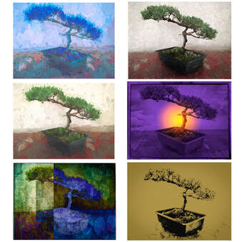 Bonsai Variations: the Selected Six Bonsai Variations: the Selected Six The results are in. The "Final Four" became the "Selected Six. For those who want to know, I will explain my decision making process in the next blog. In the meantime, let me just say that since I made the rules, I can change the rules. Because four images didn't quite look right, I requested and received permission from the fotoMuses Coordinator for the "Potpourri" exhibit to include six pieces in this group exhibit. Details about the exhibit: Name: Potpourri Artists: fotoMuses Dates: February 2 through February 28 Opening Reception on February 7, from 7 - 9 pm Refreshments will be served Location: Elmhurst Artists Guild Gallery at the Elmhurst Art Museum 150 S Cottage Hill, Elmhurst, IL 60126 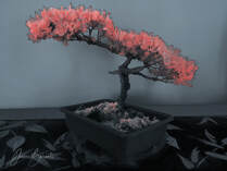 Faux Infra-Red Treatment Faux Infra-Red Treatment For the final day, I had something else in mind than this faux infrared treatment. But that all changed last night when I heard Chuck Hunnicut's presentation at the Morton Arboretum Photographic Society (MAPS for short). Chuck was talking about infrared photography, including details about light waves, camera modifications and filters, and post-processing treatments. If you are not familiar with this style of photography, infrared is part of the light spectrum that is not visible to the human eye. With modifications, both film and digital cameras can capture these light waves and create an image that we can see. Straight out of the camera, the colors are mostly magenta or light magenta, depending on how your camera was modified. The most striking result is that green foliage comes out white. In some cases, post-processing techniques can be used to bring out shades of yellow, pink, or red on the foliage, or browns, oranges, and blues in the sky and background. But what if you don't have access to an infrared camera? Can you simulate the same effect digitally with a normal image? Some say no, others say yes. At least you can approximate the look. So that is what I set out to do. After watching several online tutorials, each with its own bag of tricks, I decided to try it out on my bonsai (the image, not the plant itself). Convert to black and white, add multiple layers to swap colors and adjust hues, experiment to see what happens. Every image is different, and this one was not the most suitable for this technique. My initial try ended up a very sad mess of yellow and grey-tones. So after watching a few more tutorials, I ended up with this version. I opted to change the background to a de-saturated bluish tint instead of the muted beige. Instead of white needles, I went more towards the red, which seems to be somewhat trendy these days in the infrared world. So, stepping out of my comfort zone, experimenting with new techniques, I think this was a fitting end to my twelve day challenge. I don't think of it as one of my best works, but that was not the point of this exercise. On this final day of the challenge, let me remind you that the fotoMuses "Potpourri" exhibit will be coming very soon to the Elmhurst Art Museum. Add Friday evening, February 7 on your calendar for the opening reception. More details will be coming. Oh yes, and please do stay tuned for the selection of the Final Four. If you have favorites, I would love to hear your thoughts. In the meantime, I am printing out mini-versions of all twelve, and will be shuffling them around on my work-table to see which four work best together. 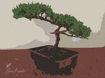 Bonsai with Craquelure Effect Bonsai with Craquelure Effect For the penultimate entry of the Twelve Day Challenge, I explored the filter gallery in Photoshop, and came across the craquelure effect. When zoomed in, it looks like the colors were embossed on canvas. That opens up a new world of possibilities on print media and post-print processing. One more entry, and then it's decision time. Whatever the final four looks like, I hope you will join me and the other fotoMuses at the opening reception on February 7 at the Elmhurst Art Museum. 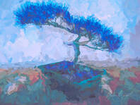 Bonsai with painterly effects Bonsai with painterly effects For Day 10, I return to an image with painterly effects, created in Topaz Studio 2. Leaning more to the abstract, it features broad brush strokes in blue and green tones, with a few umber colored accents. The blue colors are very striking, but will they work well with three other images in the series? I am trying to keep an open mind until all twelve are revealed, although I do have some favorites in mind. My twelve-day challenge is coming to an end, with decision time just around the corner. From there, on to the printing step, and final prep for the fotoMuses "Potpourri" exhibit that opens in February at the Elmhurst Art Museum. 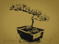 Bonsai with Mezzotint Effect Bonsai with Mezzotint Effect Day 9: The quest for "something different" continues. For this one, I stripped out the color to bring out the detail of the branches and needles. Then I added a color fill layer and a Mezzotint filter. Mezzotint was an engraving technique invented in the 17th century. The thing that I liked about it was the sparkly-shimmery look, like it was etched on copperplate. Preserving that shimmery quality on a printed surface, whether paper or silk, remains to be seen. |
Archives
July 2020
|

 RSS Feed