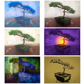
 Bonsai Variations: the Selected Six Bonsai Variations: the Selected Six The results are in. The "Final Four" became the "Selected Six. For those who want to know, I will explain my decision making process in the next blog. In the meantime, let me just say that since I made the rules, I can change the rules. Because four images didn't quite look right, I requested and received permission from the fotoMuses Coordinator for the "Potpourri" exhibit to include six pieces in this group exhibit. Details about the exhibit: Name: Potpourri Artists: fotoMuses Dates: February 2 through February 28 Opening Reception on February 7, from 7 - 9 pm Refreshments will be served Location: Elmhurst Artists Guild Gallery at the Elmhurst Art Museum 150 S Cottage Hill, Elmhurst, IL 60126
1 Comment
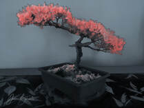 Faux Infra-Red Treatment Faux Infra-Red Treatment For the final day, I had something else in mind than this faux infrared treatment. But that all changed last night when I heard Chuck Hunnicut's presentation at the Morton Arboretum Photographic Society (MAPS for short). Chuck was talking about infrared photography, including details about light waves, camera modifications and filters, and post-processing treatments. If you are not familiar with this style of photography, infrared is part of the light spectrum that is not visible to the human eye. With modifications, both film and digital cameras can capture these light waves and create an image that we can see. Straight out of the camera, the colors are mostly magenta or light magenta, depending on how your camera was modified. The most striking result is that green foliage comes out white. In some cases, post-processing techniques can be used to bring out shades of yellow, pink, or red on the foliage, or browns, oranges, and blues in the sky and background. But what if you don't have access to an infrared camera? Can you simulate the same effect digitally with a normal image? Some say no, others say yes. At least you can approximate the look. So that is what I set out to do. After watching several online tutorials, each with its own bag of tricks, I decided to try it out on my bonsai (the image, not the plant itself). Convert to black and white, add multiple layers to swap colors and adjust hues, experiment to see what happens. Every image is different, and this one was not the most suitable for this technique. My initial try ended up a very sad mess of yellow and grey-tones. So after watching a few more tutorials, I ended up with this version. I opted to change the background to a de-saturated bluish tint instead of the muted beige. Instead of white needles, I went more towards the red, which seems to be somewhat trendy these days in the infrared world. So, stepping out of my comfort zone, experimenting with new techniques, I think this was a fitting end to my twelve day challenge. I don't think of it as one of my best works, but that was not the point of this exercise. On this final day of the challenge, let me remind you that the fotoMuses "Potpourri" exhibit will be coming very soon to the Elmhurst Art Museum. Add Friday evening, February 7 on your calendar for the opening reception. More details will be coming. Oh yes, and please do stay tuned for the selection of the Final Four. If you have favorites, I would love to hear your thoughts. In the meantime, I am printing out mini-versions of all twelve, and will be shuffling them around on my work-table to see which four work best together. 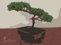 Bonsai with Craquelure Effect Bonsai with Craquelure Effect For the penultimate entry of the Twelve Day Challenge, I explored the filter gallery in Photoshop, and came across the craquelure effect. When zoomed in, it looks like the colors were embossed on canvas. That opens up a new world of possibilities on print media and post-print processing. One more entry, and then it's decision time. Whatever the final four looks like, I hope you will join me and the other fotoMuses at the opening reception on February 7 at the Elmhurst Art Museum. 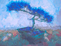 Bonsai with painterly effects Bonsai with painterly effects For Day 10, I return to an image with painterly effects, created in Topaz Studio 2. Leaning more to the abstract, it features broad brush strokes in blue and green tones, with a few umber colored accents. The blue colors are very striking, but will they work well with three other images in the series? I am trying to keep an open mind until all twelve are revealed, although I do have some favorites in mind. My twelve-day challenge is coming to an end, with decision time just around the corner. From there, on to the printing step, and final prep for the fotoMuses "Potpourri" exhibit that opens in February at the Elmhurst Art Museum. 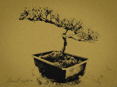 Bonsai with Mezzotint Effect Bonsai with Mezzotint Effect Day 9: The quest for "something different" continues. For this one, I stripped out the color to bring out the detail of the branches and needles. Then I added a color fill layer and a Mezzotint filter. Mezzotint was an engraving technique invented in the 17th century. The thing that I liked about it was the sparkly-shimmery look, like it was etched on copperplate. Preserving that shimmery quality on a printed surface, whether paper or silk, remains to be seen. 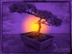 Bonsai at Sunset Bonsai at Sunset Day 8 No pixels were harmed in the creation of this image. The smoky background was created with a black and white film preset in On1 Software. I used Photoshop to create a radial gradient layer with orange and purple colors to simulate the setting sun. Still trying to decide if I want the sun to be larger. Or smaller. How would this look with any of the previous variations? Check back to see what else I come up with and what the final four will look like for the fotoMuses "Potpourri" exhibit that opens at Elmhurst Museum in February. 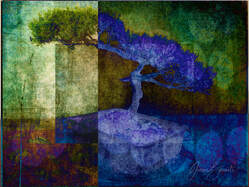 Bonsai with Bokeh Bonsai with Bokeh Day 7: Time for something completely different. Created in On1 software, this image uses overlapping rectangles in different colors + a layer with large bokeh effects + the multiple Blending Modes to invert the colors in selected areas. Because this variation is so different than the others (so far), I think it has a good chance of making it into the final four selected for the fotoMuses "Potpourri" exhibit at the Elmhurst Museum. I would love to hear your feedback on this or any of the previous day's posts. 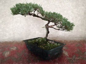 Day 6: This is the half way point in the challenge of creating digitally manipulated derivatives from a single iPhone photo. For this variation, I combined rough pencil sketch effects and soft painterly strokes using Topaz Studio 2. Part of the fun is to see how the filters and effects interact with different images, or even different parts of the same image. In this case, it is the rough sketchy effect that catches on the branches and needles, and it is the painterly strokes that provide a soft counterpoint for the background. No masking was done to achieve this dual effect. The final part of the challenge will be to select four of the images that will work together for the fotoMuses "Potpourri" exhibit opening in February at the Elmhurst Art Museum. Will this one make the cut? Time will tell. 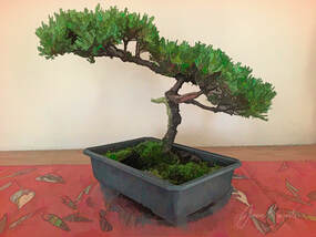 In Day 5, I return to Topaz Studio 2 and apply a "comic sketch" effect that results in some graphics-like textures on the needles and stem. I like how it emphasizes the color variety of the greenery. In the Twelve-Day challenge, I am using software tools to create a variety of looks from a single iPhone photo. In the end, I will select four images to be printed for the fotoMuses "Potpourri" exhibit that opens in February 2020 at the Elmhurst Art Museum. Stay tuned for more details about the opening reception. 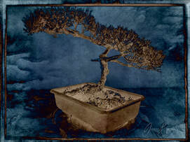 Bonsai Difference Blending Mode Bonsai Difference Blending Mode Day 4 of my Twelve Day Self-Challenge uses special effects from On1 Software, to give it a Black and White film-like quality. After adding a textured background, I used the Difference blending mode in Photoshop to obtain an inverse duo-toned look. In this challenge, I am using software tools to create a variety of looks from a single iPhone photo. In the end, I will select four images to be printed for the fotoMuses "Potpourri" exhibit that opens in February 2020 at the Elmhurst Art Museum. |
Archives
July 2020
|

 RSS Feed